Color Psychology: How to Choose Paint Colors That Enhance Your Mood
- Nov 8, 2024
- 3 min read


When it comes to home design, paint colors do more than just decorate your walls; they have the power to influence your emotions, energy levels, and overall well-being. Understanding the psychology behind different colors can help you make choices that not only beautify your home but also create an atmosphere that suits your lifestyle and personal needs.
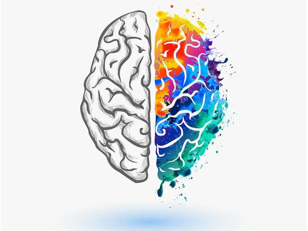
The Science Behind Color Psychology
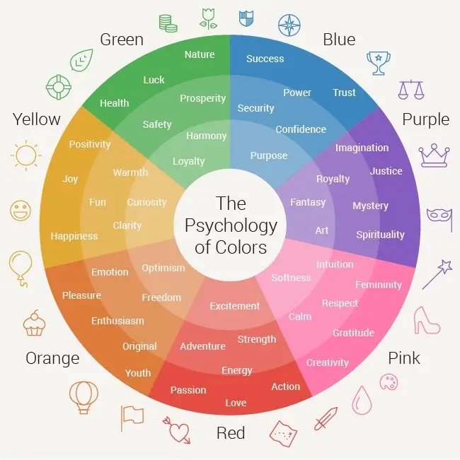
Color psychology is the study of how colors affect human behavior and emotions. For instance, have you ever felt calm in a room painted a soft blue or energized in a space filled with vibrant yellows? This is because colors can stimulate specific feelings and associations, impacting your mood and the ambiance of a room.
Choosing the Right Colors for Each Space
Here’s a guide to help you select paint colors that enhance the mood in different areas of your home:
1. Living Room: Warm and Welcoming
The living room is where you gather, entertain, and relax. Colors like warm neutrals (beige, taupe, soft gray) or subtle earth tones (terracotta, muted greens) can create a welcoming and comfortable environment. If you want to add a touch of energy, consider a feature wall in a warm, burnt orange or deep coral.
2. Bedroom: Calm and Soothing
Your bedroom should be a place of rest and rejuvenation. Soft blues, gentle lavenders, and cool greens are known for their calming properties. These shades help reduce stress and create a peaceful, sleep-friendly atmosphere. If you prefer a modern look, a muted gray with a hint of blue can also be quite serene.
3. Home Office: Focus and Productivity
For a workspace, you’ll want colors that promote focus and productivity. Light blues and greens are ideal, as they offer a sense of calm without being distracting. If you need an extra boost of energy, consider a pop of yellow or orange on an accent wall. These colors are known to stimulate creativity and enthusiasm.
4. Kitchen: Energetic and Inviting
The kitchen is often the heart of the home, and it deserves a color palette that feels lively and inviting. Warm colors such as sunny yellows and soft oranges can stimulate conversation and appetite. For a more sophisticated look, shades of light teal or sage green work well with natural wood or white cabinetry.
5. Bathroom: Fresh and Clean
To achieve a spa-like feel in the bathroom, go for cool colors like soft blues, whites, or off-whites with a touch of gray. These shades evoke a sense of cleanliness and tranquility. For a bold touch, consider a seafoam green or pale turquoise to add a bit of personality without overwhelming the space.
Understanding Color Saturation and Tone
It’s not just the color itself that matters, but also the saturation and tone. High-saturation colors are bold and vibrant, creating an energetic atmosphere, while low-saturation, muted tones provide a more relaxed and understated feel. The finish of your paint—matte, eggshell, satin, or gloss—can also influence how the color is perceived.
Pro Tips for Choosing the Right Shade
Test Samples: Always try a sample patch on your wall and observe it at different times of the day. Natural and artificial light can drastically change the way a color looks.
Complement with Decor: Make sure the paint complements your furniture and decorative pieces. Neutral tones work well as a backdrop for colorful decor, while bold colors should be paired with simpler accents.
Consider Room Size: Light colors can make a room feel larger, while darker shades can add coziness to a spacious area.
Final Thoughts
Choosing the right paint colors can transform your space and positively affect your day-to-day life. By understanding color psychology and considering how different hues make you feel, you can create a home that not only looks beautiful but also enhances your mood and well-being.


